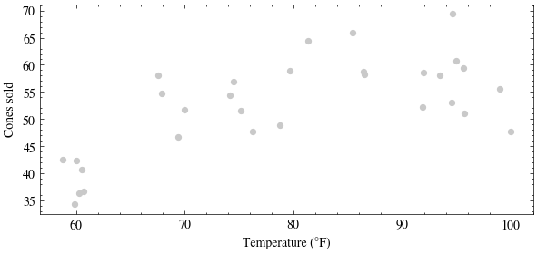
Last time we squinted at three candidate curves for the ice-cream scatter and eyeballed which one looked most plausible. Today we fit them with a linear model using the polynomial feature map \(\phi(t) = (1, t, t^2, \ldots, t^k)\).
Build the design matrix by hand for a degree-\(k\) fit: one column per power of temperature. Then solve \(\mathbf{X}\mathbf{w} = \mathbf{y}\) in the least squares sense with np.linalg.lstsq. Next lecture derives that solver; today we just call it.
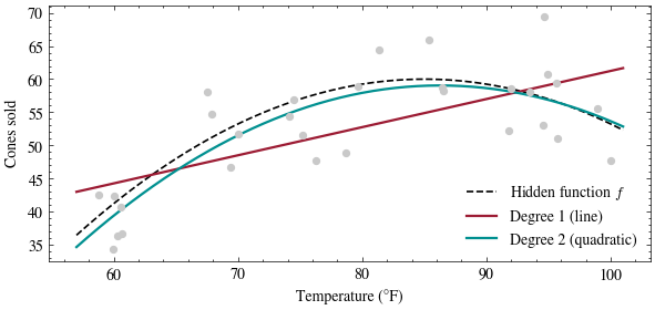
def design_matrix(t, degree):return np.column_stack([t ** k for k inrange(degree +1)])def fit(t, y, degree): X = design_matrix(t, degree) w, *_ = np.linalg.lstsq(X, y, rcond=None)return wdef predict(w, t): degree =len(w) -1return design_matrix(t, degree) @ wts = np.linspace(57, 101, 200)fig, ax = plt.subplots(figsize=(7, 3))ax.scatter(temps, sales, s=18, color=GRAY, zorder=3)ax.plot(ts, hidden_f(ts), color="black", linestyle="--", linewidth=1.2, label="Hidden function $f$")for degree, color, label in [(1, CARDINAL, "Degree 1 (line)"), (2, TEAL, "Degree 2 (quadratic)")]: w = fit(temps, sales, degree) ax.plot(ts, predict(w, ts), color=color, linewidth=1.6, label=label)print(f"degree {degree}: w = {np.round(w, 4)}")ax.set_xlabel("Temperature (°F)")ax.set_ylabel("Cones sold")ax.legend(frameon=False, loc="lower right")plt.show()
degree 1: w = [18.8568  0.4238]
degree 2: w = [-1.527021e+02  4.909900e+00 -2.850000e-02]
The degree-2 weights land near the hidden function’s own coefficients: expanding \(60 - 0.03(t - 85)^2\) gives \(-156.75 + 5.1t - 0.03t^2\). The fitted coefficients recover the quadratic using the columns supplied by the feature map.
We can also check the geometric characterization from the reading. Predictions \(\hat{\mathbf{y}} = \mathbf{X}\mathbf{w}\) live in the column space of \(\mathbf{X}\), and least squares picks the point of that subspace closest to \(\mathbf{y}\), so the residual \(\mathbf{r} = \mathbf{y} - \hat{\mathbf{y}}\) has to come out perpendicular to every column. Thirty points and three columns is more than we want to check by hand, so let’s check it in floating point.
X = design_matrix(temps, 2)w = fit(temps, sales, 2)r = sales - X @ wcosines = (X.T @ r) / (np.linalg.norm(X, axis=0) * np.linalg.norm(r))print("cosine of the angle between each column of X and the residual:")print(cosines)
cosine of the angle between each column of X and the residual:
[5.09728648e-12 5.42039652e-12 5.57966517e-12]
Increasing the polynomial degree
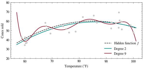
Push degree up and watch the fit start chasing individual days instead of the shared arc.
One practical note before we do. Raw powers of a temperature near \(100\) span many orders of magnitude, so the columns \(1, t, t^2, \ldots\) become hard to tell apart in floating point. Centering and scaling the input first fixes that: it changes the weights but not the fitted curve, and next lecture measures exactly this problem with the condition number.
Every curve here used the same linear model and solver; only the feature map changed. A linear model is linear in its weights and can be nonlinear in the raw input. The Methodology lecture develops tests for distinguishing a high-degree fit to individual days from the shared relationship.