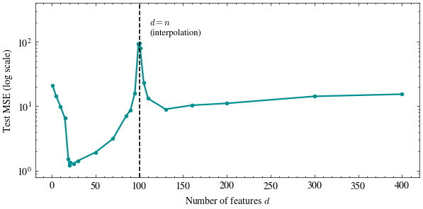
The classical U-curve predicts that once a model has enough parameters to fit the training data exactly, adding more increases test error. We test that prediction across a range of model sizes.
We fix \(n = 100\) training points and a true signal \(\mathbf{w}^*\) that lives in only the first \(d_0 = 20\) features; every other feature is pure noise, uncorrelated with the label. As the model is given more of those features (\(d\) growing from \(1\) to well past \(n\)), we refit the minimum-norm solution \(\hat{\mathbf{w}} = \mathbf{X}^+\mathbf{y}\) from scratch and score it on fresh data.
import numpy as npimport matplotlib.pyplot as pltimport scienceplotsplt.style.use(["science", "no-latex"])TEAL, CARDINAL, GRAY ="#009090", "#9c1b33", "#c9c9c9"n, d0, noise_std, d_max, n_test =100, 20, 1.0, 400, 2000def run_trial(seed, d): rng = np.random.default_rng(seed) w_star = np.zeros(d_max) w_star[:d0] = rng.normal(0, 1, size=d0) X_full = rng.normal(0, 1, size=(n, d_max)) y = X_full[:, :d0] @ w_star[:d0] + rng.normal(0, noise_std, size=n) X_test_full = rng.normal(0, 1, size=(n_test, d_max)) y_test = X_test_full[:, :d0] @ w_star[:d0] + rng.normal(0, noise_std, size=n_test) X, X_test = X_full[:, :d], X_test_full[:, :d] w_hat = np.linalg.pinv(X) @ y # the minimum-norm solutionreturn np.mean((X_test @ w_hat - y_test) **2)print(f"n={n} training points, true signal in the first d0={d0} of d_max={d_max} available features")
n=100 training points, true signal in the first d0=20 of d_max=400 available features
Sweep the number of features \(d\) from \(1\) to \(400\), four times the training set size, and take the median test error over 20 redraws of the data at each size.
ds = [1, 5, 10, 15, 19, 20, 21, 25, 30, 50, 70, 85, 90, 95, 99, 100, 101, 105, 110, 130, 160, 200, 300, 400]n_trials =20medians = []for d in ds: errs = [run_trial(seed *13+ d, d) for seed inrange(n_trials)] medians.append(np.median(errs))fig, ax = plt.subplots(figsize=(7, 3.2))ax.plot(ds, medians, color=TEAL, linewidth=1.6, marker="o", markersize=3)ax.axvline(n, color="black", linestyle="--", linewidth=1.2)ax.text(112, 130, "$d = n$\n(interpolation)", fontsize=9)ax.set_yscale("log")ax.set_ylim(0.8, 400)ax.set_xlabel("Number of features $d$")ax.set_ylabel("Test MSE (log scale)")plt.show()left = ds.index(100)right = ds.index(101)best_left =min(medians[:left])peak = medians[left]best_right =min(medians[right:])print(f"best error before the threshold: {best_left:.2f} at d={ds[int(np.argmin(medians[:left]))]}")print(f"error at d = n = {n}: {peak:.1f} ({peak/best_left:.0f}x worse)")print(f"best error past the threshold: {best_right:.2f} at d={ds[right +int(np.argmin(medians[right:]))]}"f" ({peak/best_right:.0f}x better than the peak)")
best error before the threshold: 1.22 at d=20
error at d = n = 100: 94.6  (77x worse)
best error past the threshold:  8.99 at d=130  (11x better than the peak)
Spread the signal across more features
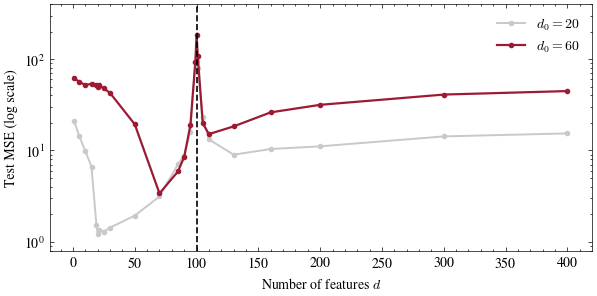
Set d0 = 60 below, so three times as much of the label is real signal, and re-run the sweep. Does the spike move, shrink, or stay where it was?
d0 =60# change me!medians_new = [np.median([run_trial(seed *13+ d, d) for seed inrange(n_trials)]) for d in ds]fig, ax = plt.subplots(figsize=(7, 3.2))ax.plot(ds, medians, color=GRAY, linewidth=1.4, marker="o", markersize=3, label="$d_0=20$")ax.plot(ds, medians_new, color=CARDINAL, linewidth=1.6, marker="o", markersize=3, label=f"$d_0={d0}$")ax.axvline(n, color="black", linestyle="--", linewidth=1.2)ax.set_yscale("log")ax.set_ylim(0.8, 400)ax.set_xlabel("Number of features $d$")ax.set_ylabel("Test MSE (log scale)")ax.legend(frameon=False)plt.show()print(f"peak stays at d={ds[int(np.argmax(medians_new))]}, "f"and the error at d={d_max} rose from {medians[-1]:.1f} to {medians_new[-1]:.1f}")
peak stays at d=100, and the error at d=400 rose from 15.4 to 44.7
The spike remains near \(d = n\) as the true signal changes because its location is determined by the design matrix’s conditioning. Spreading the signal over more coordinates raises the test error: \(n\) points constrain only an \(n\)-dimensional slice of \(\mathbf{w}^*\). The classical U-curve describes the region to the left of the dashed interpolation threshold.